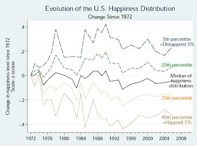
As you can clearly see:
1) Happiness inequality has narrowed since 1980;
2) The most happy have become less happy; and
3) The least happy have become happier.

Figure shows estimated percentiles in the happiness distribution implied by running a generalized ordered probit regression in which both the mean and variance of happiness are a linear function of year fixed effects.
From this we can derive the following*:
1) Inequality nowhere near what it was in 1928;
2) Likely that inequality nowhere near what it was in late 1800s.
*
Statistics don't lie unless they're impossible to figure out or have no relevance.